On
this page you will find clues on how to write arabic characters, as well
as
some
tips and tricks about tools and materials for learning to write in Arabic.
We'll
start (again) at the beginning of the Alfabet
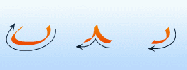
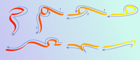
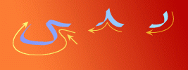
The
Alef has two basic shapes: an initial / solo, and an intermediate / end
shape.
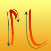
When
you write the end shape (on the right), you follow the
direction,
indicated by the arrow.
Sometimes
however, you'll enconter (or want to write) an initial / solo Alef that
looks
like the one on the right, in that case you can write against the direction
that
the
arrow indicates.
The
example on the left of the picture carries a serif, it has no special meaning
except
that
it looks nice (compare "Times new roman" and "Arial" (true type) fonts).
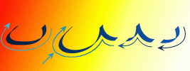
The
most common shape in the Arabic alfabet is this one:
The
inital and intermediate (left and middle) forms are used in.
five
instances: for Ba`, for Ta`, for Tha`, for Noon and for Ya`.
The
final form (not shown here) is used in Ba`, Ta`, Tha`.
Noon
and Ya have their own final and solo forms, as we will see later.
It
is important when you practice these using a wide tipped pen, that you
make sure
the
with of the pen keeps the same angle all the time.
Try
to write a whole line of intermediate forms without stopping and try to
make
them all exactly alike.
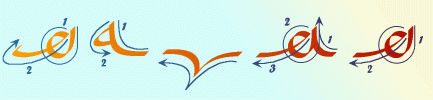
The final shape
of the next three characters must be invented by a calligrapher
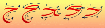
as the swooping
elegant tail clearly indicates.
The intermediate
forms can be connected either over the top
(often used when
preceeded by a Lam) or around the bottom.
The numbers indicate the sequence to follow when writing this shape.
Because a large
part of the character is written pulling the pen from
left to right,
it is actually easier to write (for a Latin-font user) than it looks.
In fact, the latin-font
intermediate "written" small "r" looks almost exactly like
the final shape
Ha`
Since Dal and Thal
are never connected to their left,
there are basically
only two shapes; solo and final.
Sometimes you'll
see the vertical line being extended or bend
backwards for
esthetic reasons.
Again the numbers
indicate the writing sequence.
Ra and Zayn are
basically the same as Dal and Thal.
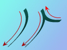
only do they protrude
underneath the line.
They can occur
in a number of shapes, varying
from long swoops
to crescent moons.
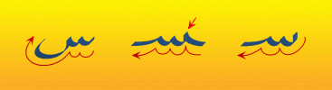
Seen and Sheen
are fairly straight forward, note that for
easy recognition,
the first "top" of the character is written slightly
higher than the
others, especially with Seen (arrow).
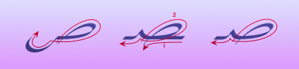
Sad and Dad are
a little bit more awkward to write, there are several
different ways
to do it, personally I write it as indicated above.
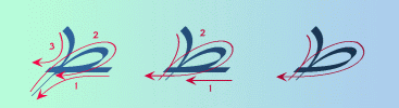
Tah and Thah are
again a bit more complicated, they can have a tail that
protrudes underneath
the line, but often they don't.
You'll have to
lift your pen off the paper to write it, as doubling
your already written
line will almost certainly result in
an inky mess.
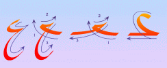
Ein and Ghein
on the other hand are quite simple as they
resemble the mirror
images of the numbers 2 and 3.
The Fa is a bit
like a scorpio; the venim is in the tail which has
to be straight
and horizontal.
Mind that the
angle between the body and the tail of the inital and solo
variants is square
(arrows).
And don't forget
the dot !!
The Qaf is easier,
as a swoop is easier to write than a straight line.
Also mind the
rounded angle between the body and the connection line (arrow).
Again, whatever
you do, don't forget the dots !!
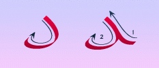
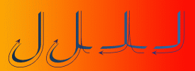
With Kef you should
make sure you make the "hook" long and clear enough
so that it doesn't
look like a Dal, also when you write a final form
without the "hook",
make sure you write a hamze otherwise it can be
mistaken for a
Lam.
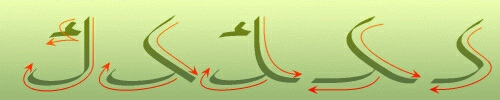
The Lam character
is easy to write, since it resembles the latin font "J" in
almost every aspect
except that Lam sticks out above the line as high as Aleph.
Sometimes initial
and intermediate forms are equipped with a "tail" that
protrudes underneath
the line, like the final and solo shapes have.
Don't mix Lam
with Aleph, Aleph is never connected to the left while
Lam is connected
in both directions.
The Meem character
comes in a variety of shapes ranging from something
that looks like
a written "o" up to something that looks like a tight "v".
The tail of the
final and solo shapes also varies from a short straight line
(either vertical
or at an angle) to a huge swoop.
There is also
a
special "Lam-Meem" combination, as we will see later.
The Noon character
is, in most instances written the same
way as Ba`, Ta`,
Tha` and Ya`, except the final shape, which
protrudes below
the line (arrow).
Of course you
mustn't forget the dot!
He also has a
wide variety of shapes, ranging from an "8" which is connected
through it's center
to a sort of "v".
The final shape
has an even wider range; from a simple sort of "a" like shape,
to a swooping,
and often somewhat narrowed sinus-wave.
The final He (as
in "Allah") should not be confused with the Ta`-marboota,
although the pronunciation
is often the same (the "h" at the end of
the name Sarah
is a Ta`-marboota, not a He).
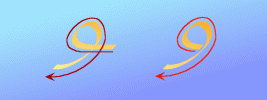
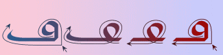
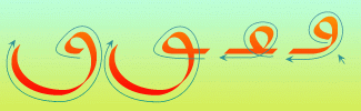
Perhaps the simplest
character to write, since it looks exactly like a number 9.
The tail protrudes
below the line, probably to distinguish it from a real 9.
And the last one:
Ya`, this one also protrudes below the line.
Note that the
final shape differs from the final Noon in two ways;
firstly it is
somewhat widened and flattened (which,
in my personal
view, makes it look more interesting) and
secondly the final
and solo shapes are the same.
The arrow points
at the "intro/connection" of the Ya`.
It should always
be written as an S-shape in a single move, unlike
the Noon where
the pen stops and then moves down.
Should you forget
the dots in the final charcter, it will be mistaken for an
Alef-maqsura (Alef-leina)
by most people, except in Egypt, where they never
write dots under
a final Ya`.
"But how do you
know the difference ?" I asked an Egytian friend,
"You just know
!" was the answer.
One can only say
that the Arabic script is (especially estheticaly) highly
developed only
sometimes, to westerners, in odd and mysterious ways.
This
page is
Yet
to follow:
Lam-combinations
Ta
marboota
Hamze/Alef-maqsura
Tashkeel
and Naqt
When you, as a
right-handed person, first start writing from right
to left, you'll
quickly find out that your pen wobbles from side
to side and (especially
a fountain pen) has the tendency to dig itself into the sheet.
You can ofcourse
cheat and write backwards but that leaves you with
the problem of
determining where to start writing in order to get a straight
page margin at
the beginning of the lines of text.
The easiest way
to begin practicing is to use a normal (medium to soft tipped) pencil.
This however,
will not produce the narrow-wide-narrow lines that look so
spectacular in
many instances.
So
once your lines have ceased to get wobbly using a drawing pencil, you are
ready
for the next step.
Go
to a harware store (what ???) that sells carpenting tools and look
for
carpenter's pencils.
This
type of pencil (you can't miss them, they're always red on the outside)
has
a rectangular nucleus that is about 4 times as wide as it's thick (so that
rough
and tough carpeting people don't break the tip each time they draw a line).
You
have to use a sharp knife and cut away the wood (they usually come unsharpened)
and
make sure the tip stays rectangular and flat.
Using
it to write, you'll notice quickly that it moves with ease in all directions.
When
using this type of pencil it is important that the surface you write on
is not too
soft
because the tip tends to wear rounded on a soft surface, ideal would be
a smooth
desk
with a few sheets (2 or 3) of paper underneath the one you're writing on
What's on your mind?